


Blue Paint: Light, Dark & Navy Wall Paint | Walmart


About Blue Paint: Light, Dark & Navy Wall Paint | Walmart - Walmart.com
Blue paint helps you shape a room's mood with color that feels calm, crisp, or dramatic. You can compare shade, finish, application area, and base type to choose a look that fits your space.
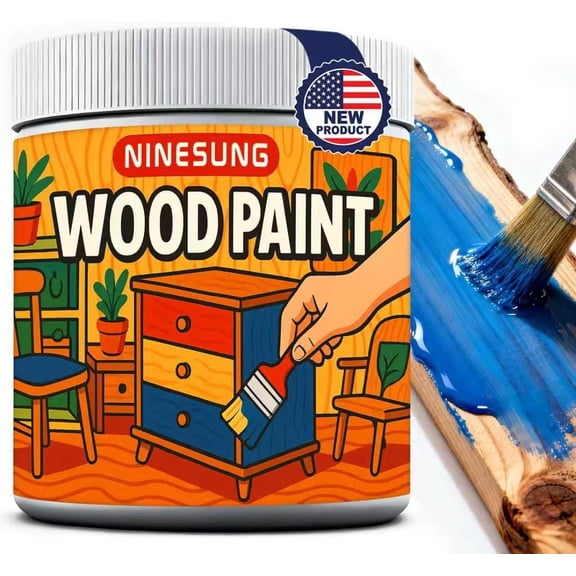
If you're updating walls, cabinets, or furniture, blue paint gives you clear style range. You can move from airy baby blue to deep navy blue paint without leaving this category.
How to choose blue paint by shade
You should start with shade because lighting changes how blue appears through the day. You may notice light blue paint looks softer in morning sun and cooler under bright overhead bulbs.
Natural light usually reveals more of a blue undertone, especially near large windows. Artificial light can make your color look grayer, greener, or slightly deeper than you expected.
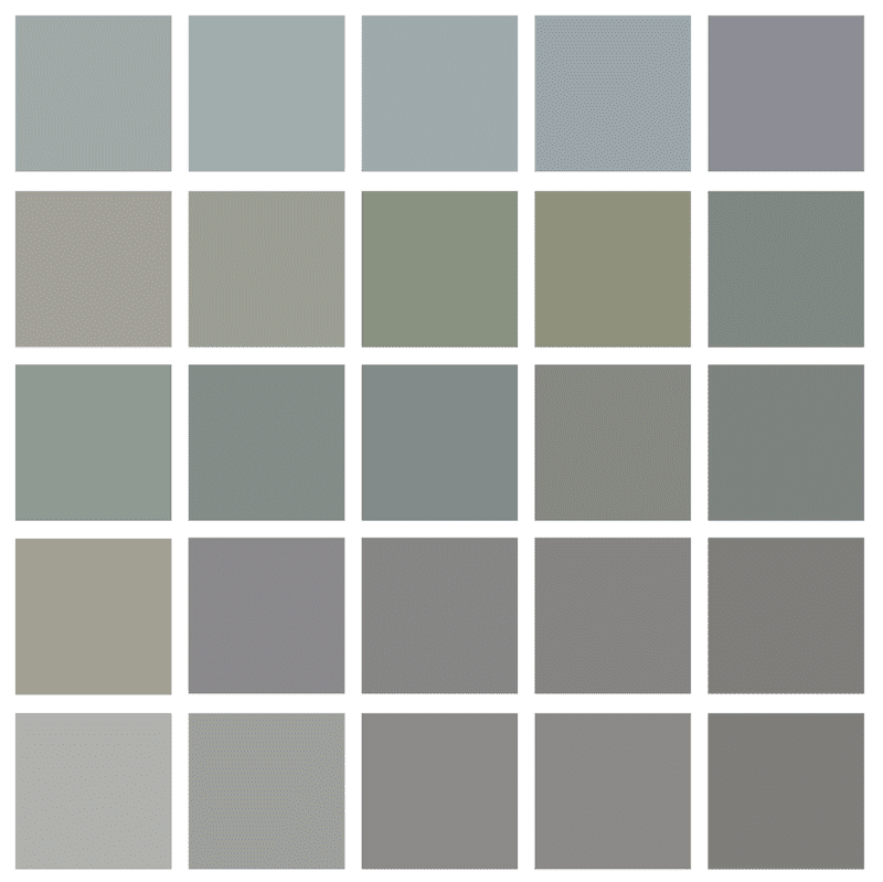
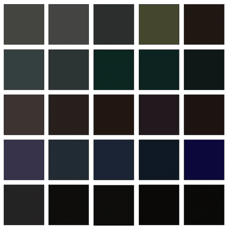
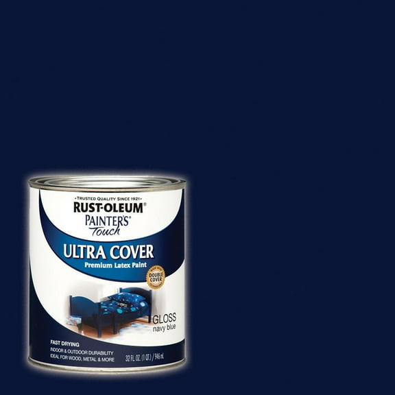
You can use dark blue paint when you want stronger contrast on accent walls, doors, or dining rooms. You can use royal blue for bold color, while baby blue keeps nurseries and bedrooms lighter.
- You can choose light blue paint to make small rooms feel more open.
- You can choose dark blue paint to add depth around trim, built-ins, or statement walls.
- You can choose navy blue paint when you want a classic look with strong contrast.
- You can compare warm and cool undertones so your blue works with wood, white, or gray finishes.
When you compare swatches, you should check them in daylight and evening light. You can avoid surprises by viewing the color beside flooring, cabinets, and nearby fabrics.
Choosing the right blue paint finish
You should choose finish based on room activity, surface texture, and how much sheen you want. You can use flat or matte finishes to soften wall flaws and reduce glare.
Eggshell gives you a light glow that works well in bedrooms, living rooms, and hallways. Satin offers more wipeable performance, so you may prefer it in busy family spaces.
Semi-gloss works well when you want more shine on trim, cabinets, and doors. High-gloss gives you a reflective look that can highlight furniture details and decorative surfaces.
If you're choosing blue interior paint for kitchens or bathrooms, you should compare finishes carefully. You may want satin or semi-gloss when you expect more moisture and frequent cleaning.
Traffic levels matter because active spaces can show scuffs faster on lower-sheen surfaces. You can often use flatter finishes in quiet rooms and shinier finishes where touchpoints get more use.
Comparing application area and coverage needs
You should match your paint to the surface you plan to cover. You can shop blue interior paint for bedrooms, ceilings, hallways, and shared living areas.
For exterior projects, you should look for formulas made for siding, shutters, doors, and trim. You can also compare options for furniture and cabinets when you want a coordinated color story.
Coverage depends on your starting color, your surface condition, and the shade you choose. You may need extra prep when you're painting over dark colors, glossy surfaces, or patchy walls.
If your current wall is very deep or uneven, you should consider a primer before color coats. You can improve color consistency and help your blue shade look closer to the sample.
You should also check whether your surface has texture, raw wood, or older finish layers. You can get a cleaner result when your prep steps match the material underneath.
Understanding base type for your project
You should compare base type because cleanup, dry time, and surface use can vary. You can often choose water-based, latex-based, or acrylic options for many common home projects.
Water-based and latex-based paints usually suit walls and many everyday updates around your home. You may like easier cleanup and a practical option for frequent room refreshes.
Acrylic formulas can work well when you want strong adhesion on selected surfaces. Oil-based options may suit certain trim or furniture projects where a specific finish matters.
You should check the label for the intended surface before you commit to a formula. You can narrow your choice faster when base type matches your room, project, and cleanup preference.
Using blue paint in real rooms
You can use pale shades in bedrooms, nurseries, and reading corners when you want a lighter feel. You may pair light blue paint with white trim for a crisp, coastal look.
In dining rooms or offices, you can use dark blue paint to create a grounded backdrop. You can balance that deeper shade with warm wood, brass accents, or soft neutral textiles.
If you're updating cabinets, you should compare satin and semi-gloss finishes for a polished appearance. You can use navy blue paint on islands or lower cabinets for strong contrast.
For bathrooms, you should think about both color and finish together before you start. You can pair a medium or dark blue with a sheen that fits frequent cleaning and daily moisture.
You can also carry one shade across furniture, trim, and walls for a layered design plan. You may prefer different sheens within the same color family to create subtle contrast.
When you plan carefully, blue paint helps your room feel intentional from the first coat. You can choose a shade, finish, and formula that fits your surface and your lighting.